Type + Image Design
Type + Image Design
RISD SUMMER 2020

PROFESSOR: FRANZ WERNER
DESIGN TOOLS: Adobe CC - Illustrator, Photoshop, Acrobat
DURATION: June 22 – July 31, 2020 (6 weeks)
background
Typography in conjunction with imagery poses as a challenge for many designers. Through this course, I was given the unique opportunity to connect the dots between these two mediums.
Topics I explored include:
Typographic Fabrics
Typographic Expression / Composition / Animation
Pixel Icons
Creating an Alphabet
Form & Counter-form
NOTE: Each assignment consists of a list of requirements that aren’t explicitly listed.
PROJECT: Typographic Patterns
Duration: 5 week days
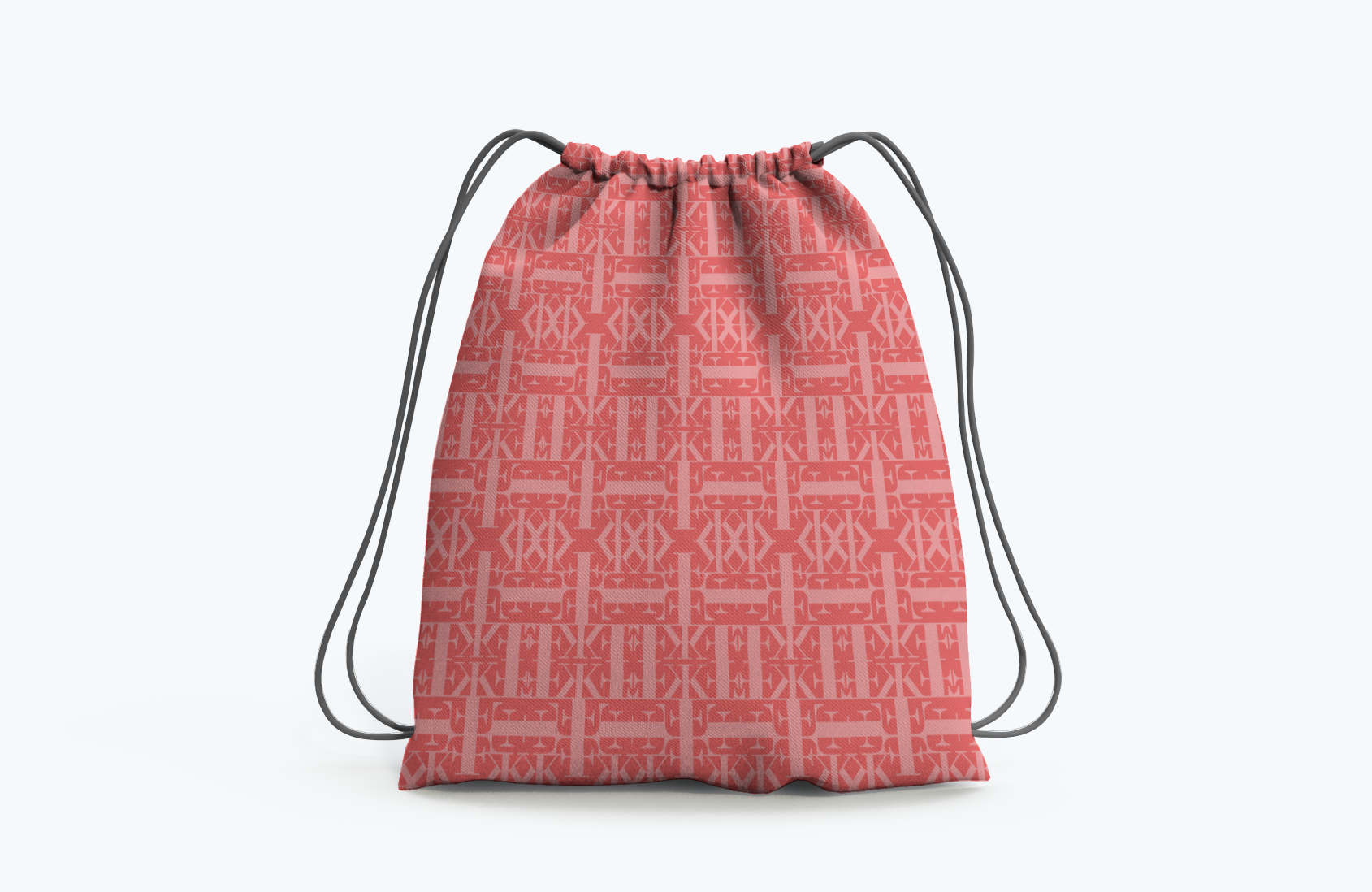
Select one or two fonts of the given font families to develop a 3 typographic patterns with.
My Patterns

Font: Walbaum MT Std

Font: Gotham
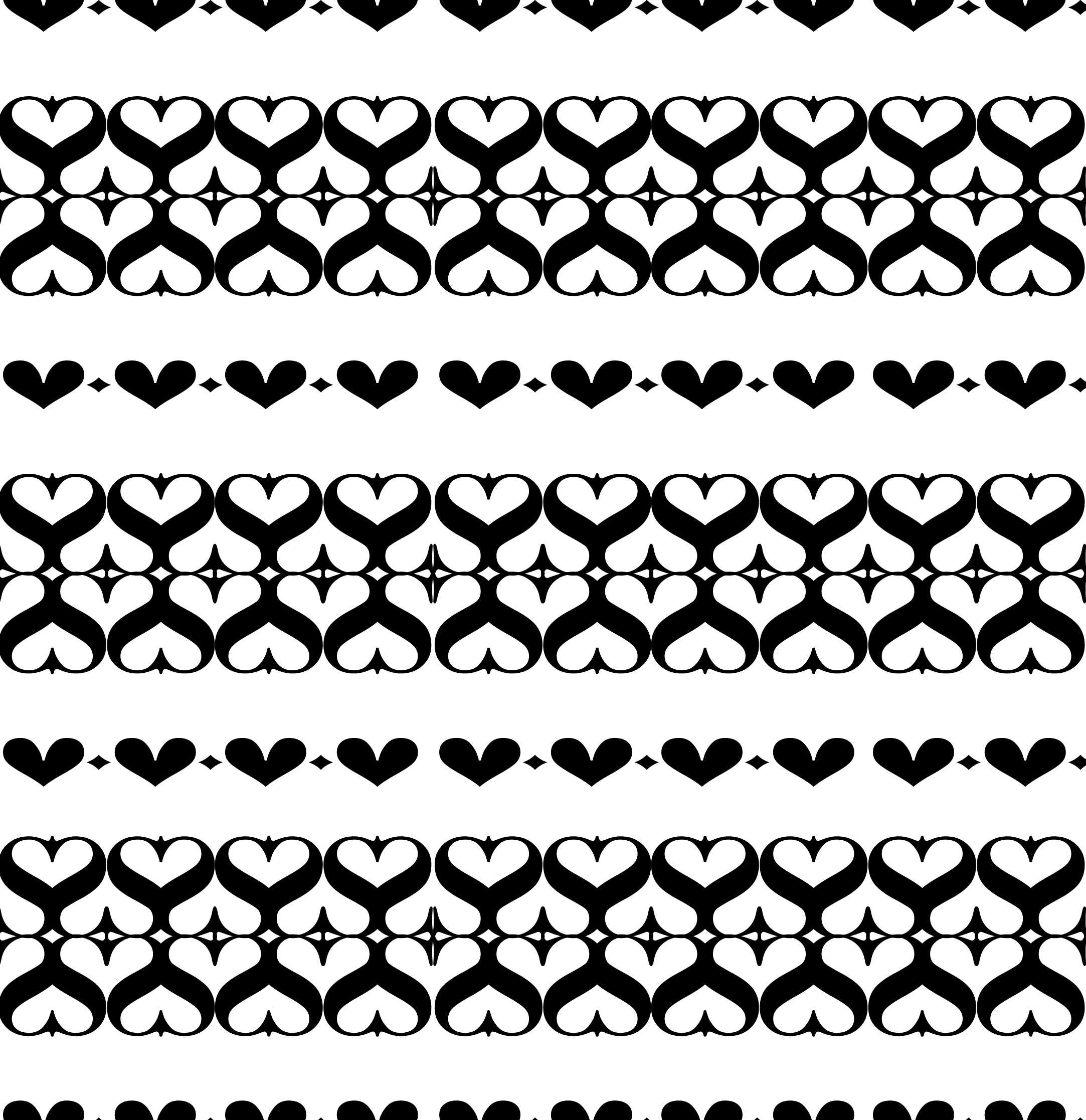
Font: Bodoni



PROJECT: pixel dog
Duration: 3 week days
Task: To create an unmistakable representation of a dog breed within a 16 x 16 pixel grid.
Key Takeaways
Scale v. Resolution: Learned how to effectively simplify complex information by using minimal pixels to recreate dog breeds

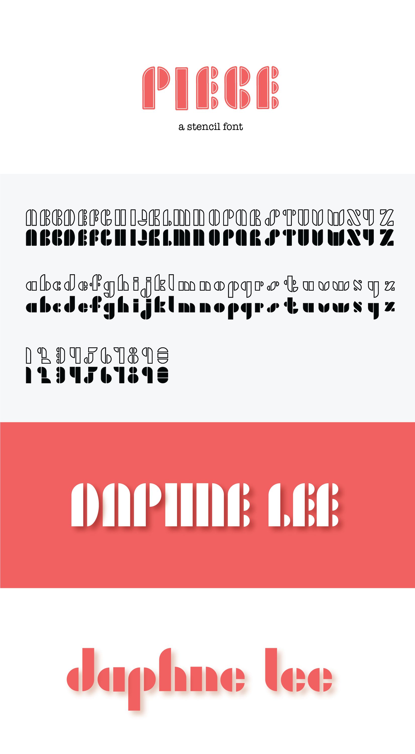
PROJECT: alphabet
Duration: 3 week days
Task: To design a Latin alphabet in upper and/or lower case (numerals are optional) based on a system
Key Takeaways
Learned how to design and develop functional writing systems of various styles


PROJECT: Forces on your page
Duration: 5 week days
Task: To work with a required set of text and instructions to design, manipulate and express this text in a way that could be visually understood.
I had to find solutions with the following characteristics: Chaos/Order; Flatness/Depth; Stillness/Motion; Form/Counterform
Key Takeaways
Comprehension of semantics in typography and compositional values
How to use type effectively to convey meaning and develop meaningful juxtaposed expressions


PROJECT: FORM & COUNTERFORM
Duration: 3 week days
Task: To investigate the relationship of form and counter form in a few selected letterforms and numerals of the Latin alphabet by combining a white letterform or a white numeral on top of a black, solid shape such as, circle, square, or triangle.
Key Takeaways
Used shape and letterform combinations to explore contrasting or uniform typographic expressions and discover effective character-shape ratios
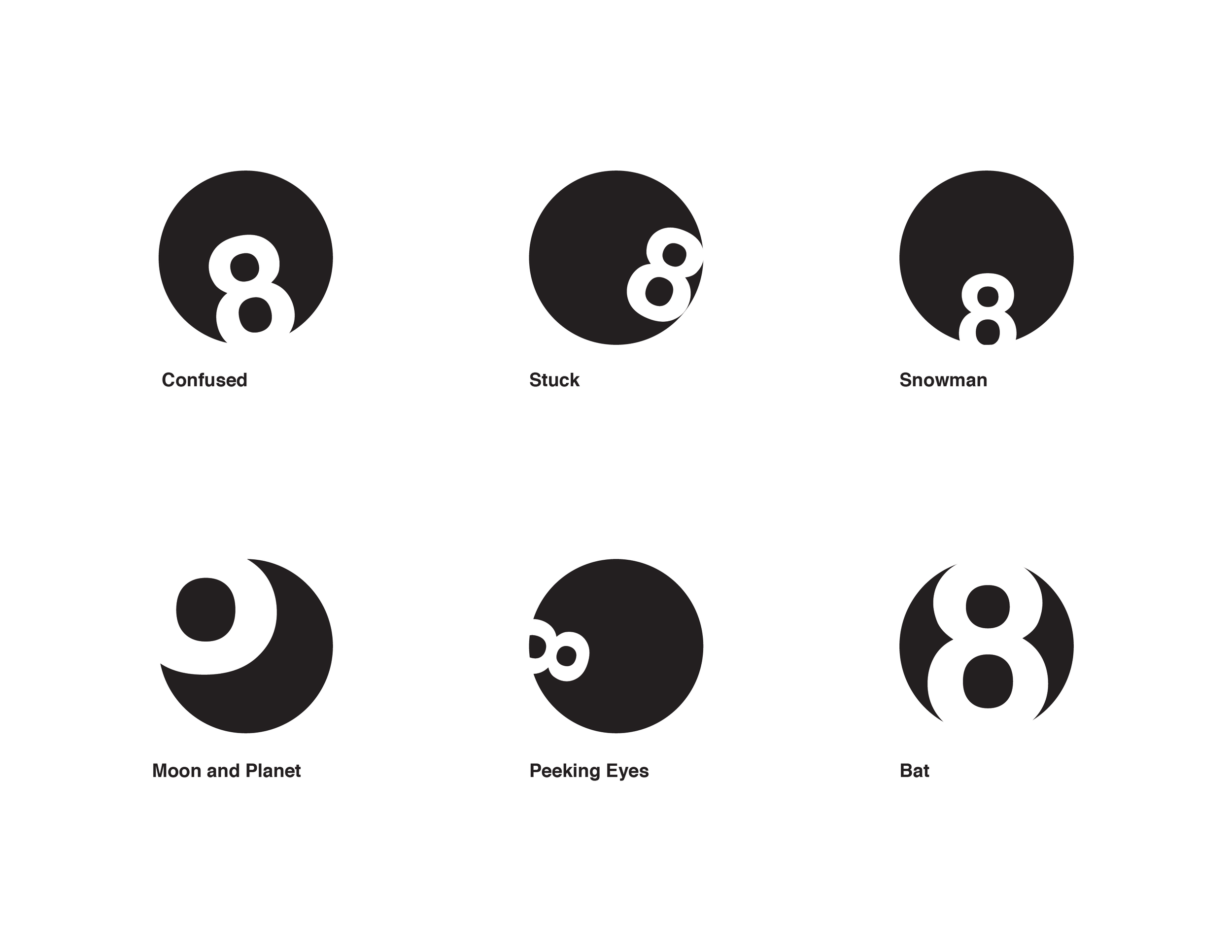
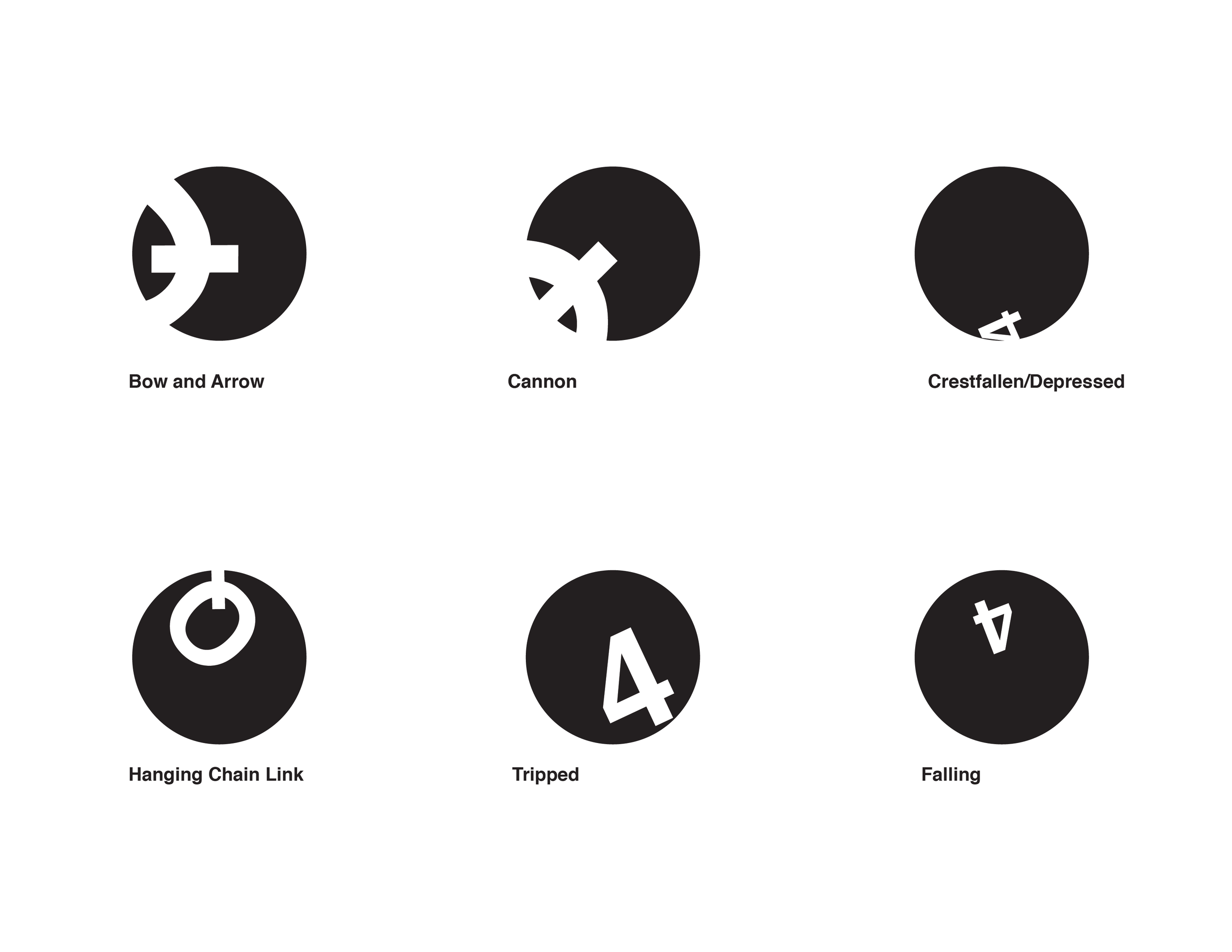


Visual Solutions Part 1

Visual Solutions Part 2

Legible Solutions
REFLECTION
What were some challenges I faced?
As this class was an asynchronous online course, I had to learn how to navigate around a new online platform called CE Link in order to receive and provide feedback from and to my peers, how to utilize the time allotted for each project effectively in order to maximize results, and how to stay motivated within an environment filled with very little opportunities for interaction with my peers.
The lack of in-depth online lectures and interaction made it difficult to receive any project feedback throughout the process of working on my projects.
In order to combat this, I started posting my project drafts in the class forums to receive earlier feedback from both my peers, TA and professor.
I also started regularly attending office hours every week with my TA in order to either clarify aspects of the project guidelines or ask for more in-depth critiques regarding my current drafts or previous assignments.
What did I learn from taking this course?
This course gave me the opportunity to take a closer look into the various perspectives my peers had when tackling the same assignments and allowed me to gain a better understanding of my strengths and weaknesses when it comes to creating.
I noticed that I tend to have more complex visual-oriented approaches and tend to stray away from simpler designs due to the fear that the solution may seem like I didn’t try hard enough or that it is not complex enough to be a proper solution; however, through this class, I learned that even the simplest of designs can have powerful messages and learning how to accept and effectively utilize this simplicity would only help me expand the possibilities and options I have available to explore.
Overall, this class not only gave me the opportunity to take on unique challenges I wouldn’t have had the opportunity to explore by myself, but it also allowed me to gain new perspectives and insights not only into my own design style and approaches, but also into those of my peers. If given another chance, I would love to take another course at RISD in fields related to Graphic Design, Illustration and more!
