Connect
Connect
BUILDING A SEAMLESS STUDENT EXPERIENCE
ROLE: UX Designer DESIGN TOOLS: Sketch, Adobe Illustrator, Adobe XD DURATION: 1 Week
This project was a one-week design sprint challenge. The prompt I was given was to create an experience for incoming students to easily browse, search and propose new student organizations. Often times, students are overwhelmed when seeing the large number of organizations at events such as activity fairs or orientation. As a result, students may accidentally glance over organizations they may actually be interested in joining. By creating an opportunity for students to browse through all of the clubs/organizations their school offers, students will have a higher chance of finding a club/organization they like.
Challenge
How can I consolidate every organization in your school into one easy-to-access platform?

I chose to focus on my undergraduate university, Carnegie Mellon University. CMU has almost 400 different organizations on campus. CMU has “The Bridge”, an online student portal that allows students to browse organizations and recent events; however, this is quite outdated and is not very well known to many students.
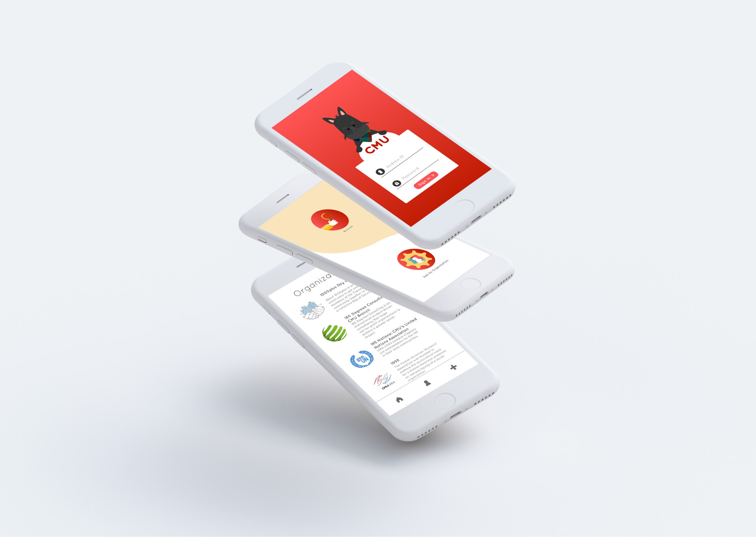
My goal is to make a CMU-based mobile application so that student's can also link their student information account (SIO), a platform we all use on a very frequent basis. Due to the short time frame, I focused on creating a simple wireframe flow and a couple high-fidelity screens for this exercise.

Research/initial sketches
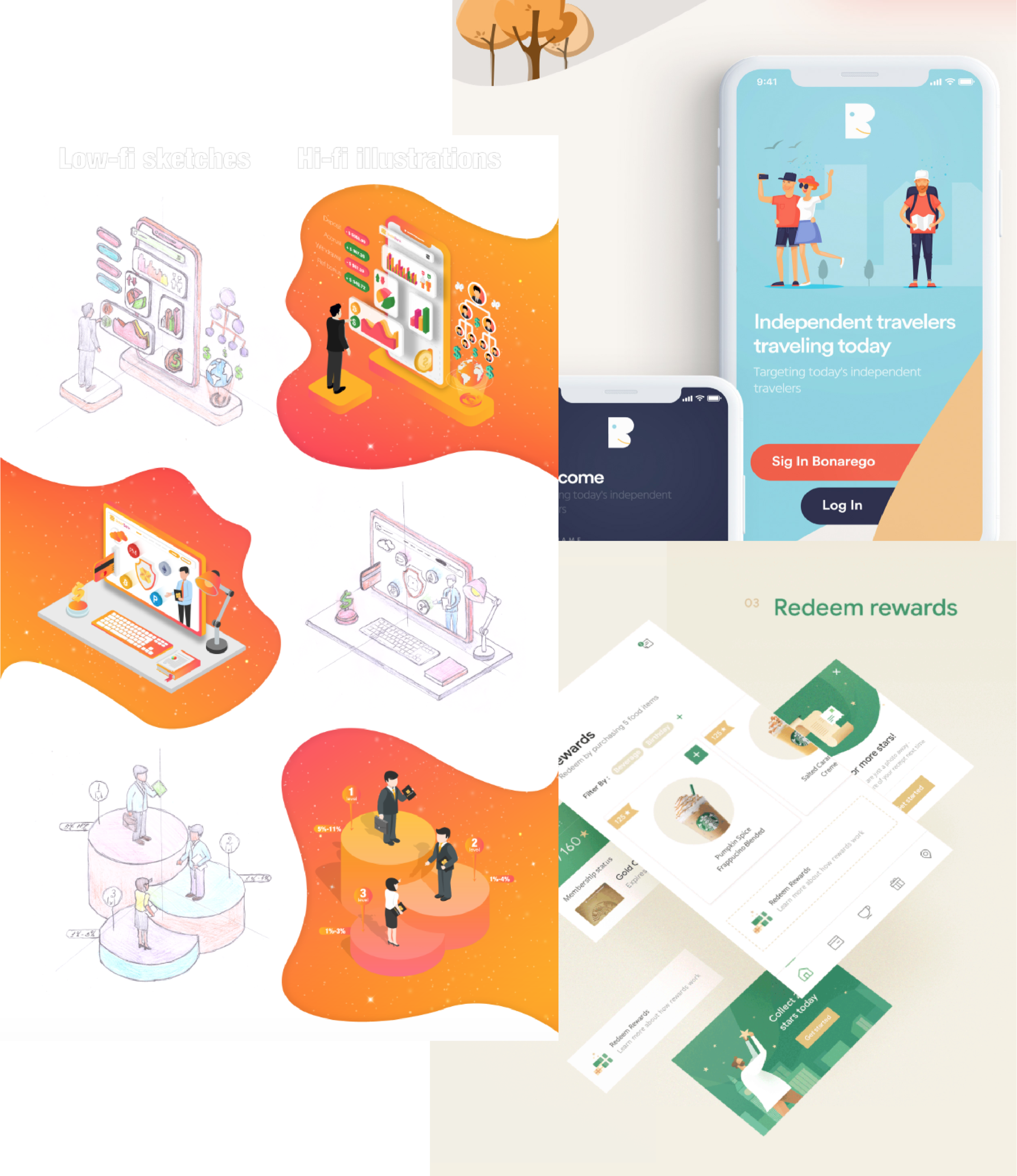
I kicked off this project by researching different mobile application designs and formats. I noticed a majority of designs that caught my eye used vector illustrations and clean formatting, so I tried to apply these aspects to my design. Another unique trend I noticed was the use of gradients. When used properly, I think gradients can really add another layer of depth and creativity to designs.


I started with sketches of potential main screen designs and logo designs. A common aspect between all of my logo designs was CMU’s Mascot, the Scotty Dog.
I wanted to focus on having a clear and intuitive design for this application. I decided to use tags instead of categories because I thought it would allow students to have more specific search options as users can choose to include more than one tag. I decided this after confirming there would not be an overwhelming number of tags due to CMU’s nature and relatively small student body.
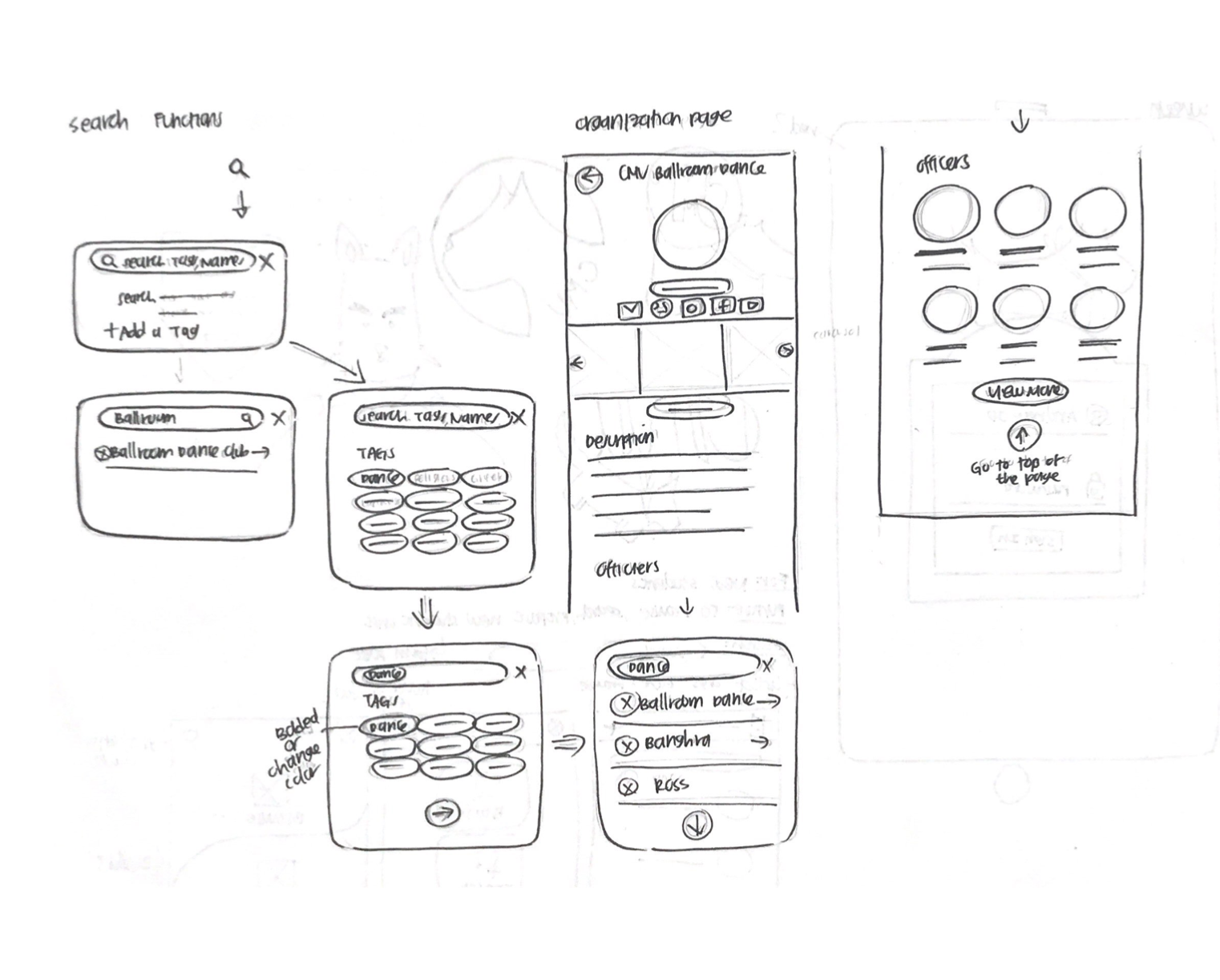
Initial Sketches—Browsing/Organizations
Initial Sketches
Low Fidelity Prototype
The purpose of this low-fidelity prototype is just to show clear relations and interactions between the pages and buttons.
Main Page > Choose Your Action Page > Browse Organizations Page or Add an Organization Page
Browse Organizations Page > Search Bar or Individual Organizations Page
Search Bar > Search by Tags or by Typing > Organizations Page
Icons
I experimented a lot with different shades and shapes of gears. I challenged myself to make icons from scratch using simple shapes and tools. Creating these icons were a good way for me to familiarize myself with the ShapeBuilder tool once again and to get a deeper understanding of complementary/good color combinations.
The Scotty dog was actually quite hard since I couldn’t figure out how the shading on the dog’s face worked no matter how hard I tried. I had a lot of help and advice from my peers before I got to the final version shown below.
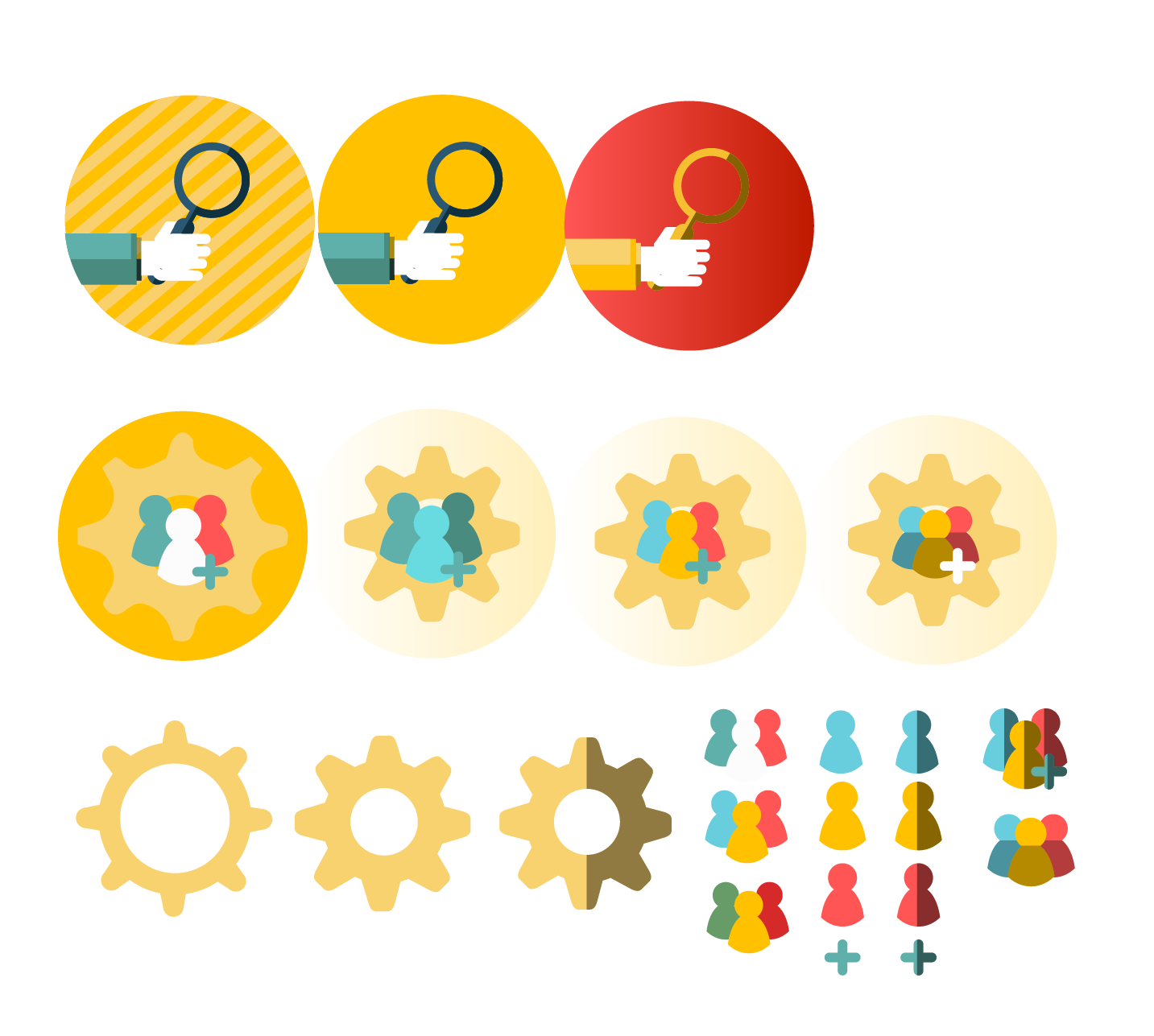
Icon Practice
Scotty Dog Process
Colors/Fonts
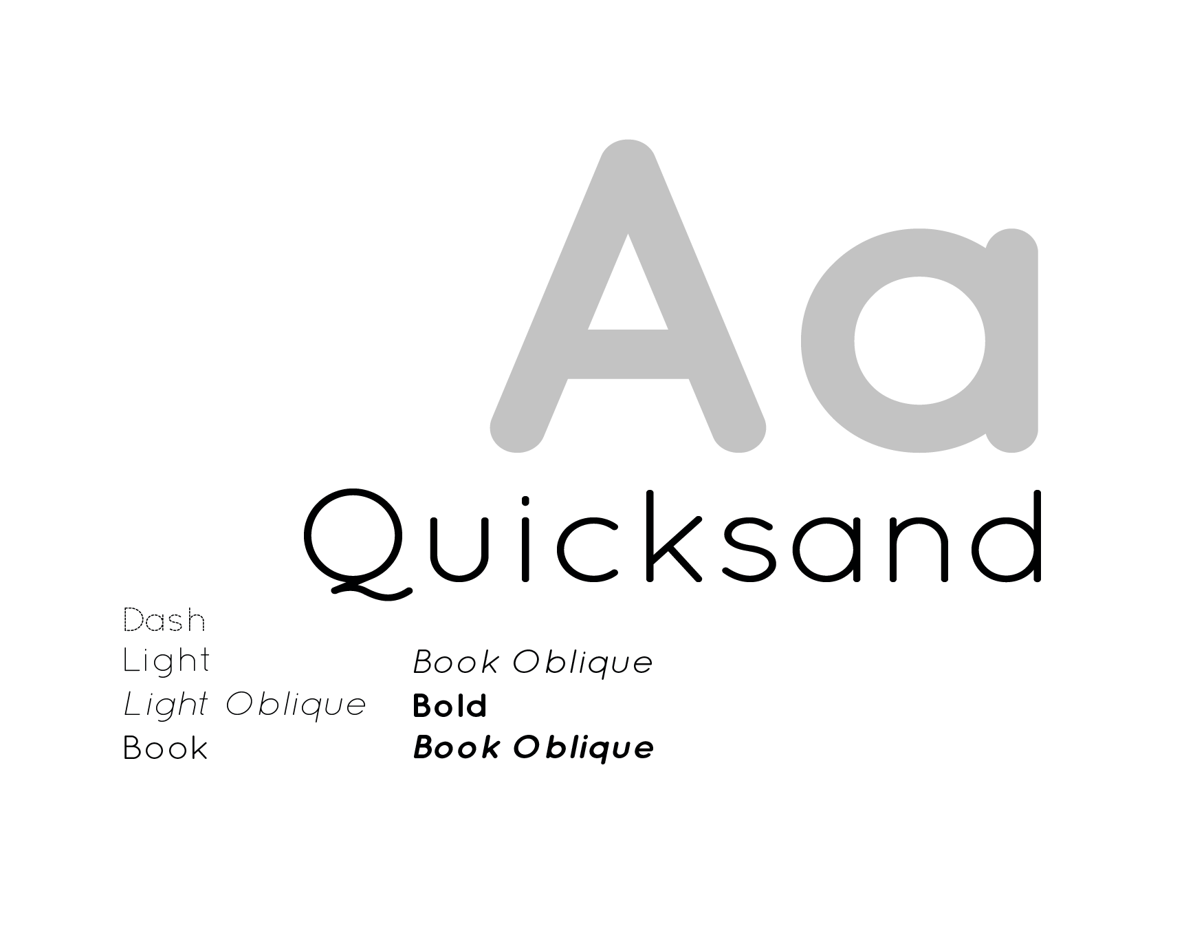
I chose colors based off of CMU’s school colors—black, white, grey and cardinal red. I chose the yellow as the accent color mainly for items such as icons and potentially buttons or tags. After experimenting with many fonts, I decided to choose Quicksand due its soft and rounded edges, making it feel neat yet very approachable.
Design Iterations
“Choose Your Action”
There are 4 versions of this page as I am still trying to decide official colors for the icons and backgrounds. While I’ve asked many for their opinions and critiques, I’ve just received several mixed opinions. I tried focusing on the continuity and consistency between the colors. While I like the yellow and teal look the best, it doesn’t flow very well with the red main screen (5th in the row below).

2. Main organizations page
I initially wanted to use alphabetical yellow buttons to categorize the items, but I felt that using a scrolling alphabetical mechanism would not only make it easier for users to move around but would also prevent users from accidentally tapping other buttons. As this vertical design is used on iPhone “Contacts” and WeChat “Contacts”, I think the familiarity with this concept would also be beneficial.
3. Search
There are 2 ways to search for organizations.
Type — Type in the name of the organization you are looking for and the application should automatically filter results based on your search query.
Tags — Tap on the tags to filter organizations.

Reflection
What were some challenges/struggles?
I struggled trying to solidify a design concept to work with. Actually implementing an idea and creating a functional design wasn’t as easy as I expected. The first three days were used for me to actually brainstorm potential design and application ideas.
Another challenge I had was learning how to start “simple”. Rather than starting by creating some low-fidelity wireframes, I started with some high-fidelity wireframes as shown below. I did not notice that I was working backwards until someone pointed it out to me during my design process; however, I think this project was one that really opened my eyes to learning how to focus on the big picture first rather than the nitty gritty details.

What did I learn from this project?
This project really taught me how to work on a time crunch and to push my design thinking skills to the max. I really had to work my brain in order to keep churning out ideas because it’s very easy to get complacent and settle for the first design that you draw. During this project, I learned how to create a wireframe flow, and while it’s not perfect, the functionality exists. I also learned that sometimes you may have creative blocks and you can’t just keep beating yourself up about it. It’s better to take a small break or take some time to scroll through some design inspirations on the web rather than trying to continuously come up with new ideas. This usually just ends up creating subpar designs that may not reflect what you can actually create.
MOVING FORWARD
If I had more time, I would love to continue to…
Tinker with the colors and usability of the functions
Continue creating additional pages, such as the User Settings page
Get some real feedback/potential user testing sessions
Come up with some new design concepts
